More U.S. Presidential Election Maps
Election maps definitely have been a popular subject this past week: not only are different maps of the U.S. presidential results popping up all over the web, but traffic at The Map Room has more than tripled since Nov. 2 (2,300+ on Thursday). In that vein, and to let it ride, here are some more:
- Canada by Comparison. In the wake of those maps that split off the Democratic-majority areas and join them with Canada (excuse me?), this map attempts to show where in Canada the vote has been more than 45 per cent conservative. It’s only an approximation, because “conservative” doesn’t quite mean the same thing over here. (Also, we use blue for the Conservative Party and red for the Liberal Party, which this map inverts for U.S. political colours, which plays havoc with Canadian brains.)
- Switch shows which U.S. counties have switched from one party to the other between the 2000 and 2004 presidential elections.
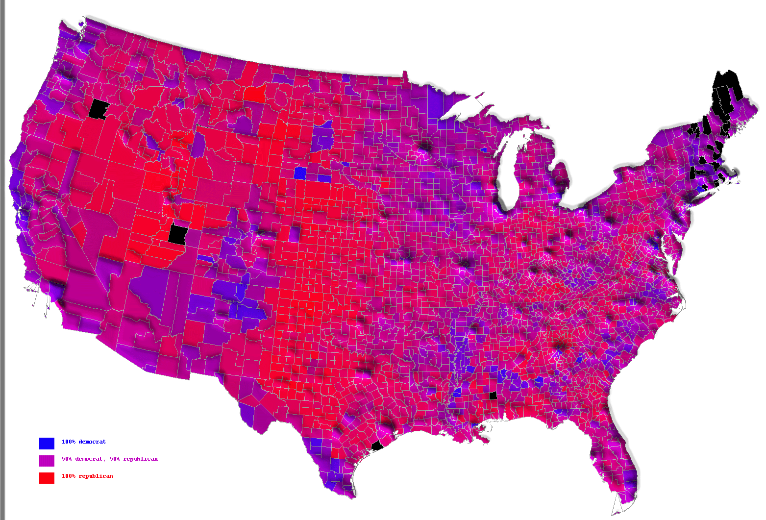
- U.S. county results with population contour lines. I have no idea how this works.
(Via Darren; via Richard. See previous entries: U.S. Election Results Cartogram; U.S. Election Results; CSPAN’s Election Map.)

Comments
blog comments powered by Disqus