U.S. Election Results
The results of the U.S. presidential election have been mapped in a number of ways. For some, there are two Americas, and one of them is, um, Canada — instead of running away to Canada, some think Canada should come to them. Fun.
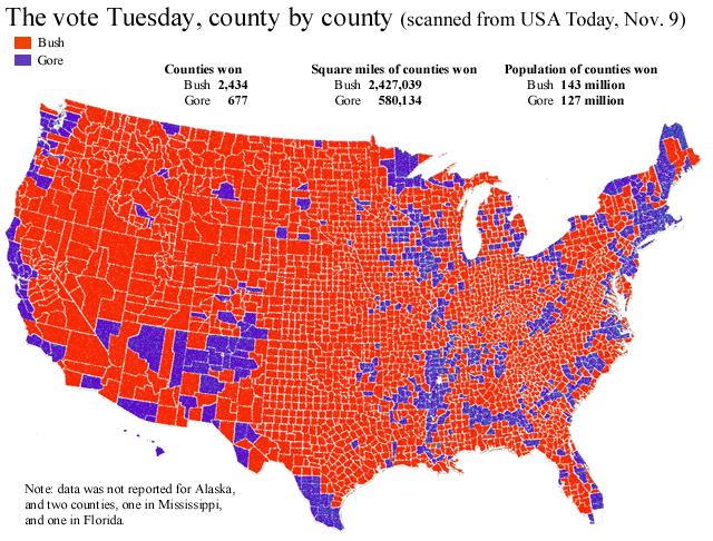
For others, America is purple. Instead of showing states as absolutely blue or red (representing Democrat and Republican majorities, respectively), Jeff colours each state a shade of purple to show the extent to which each is one way or the other: i.e. the bluer, the more Democratic. This map extends it to each county, which shows some really interesting patterns within each state. For comparison, here are the 2000 results.
Speaking of the county-by-county results, Richard links to non-purple county results maps for 2004 and 2000 (1, 2).
Update: See Terri Senft’s post on election maps.

Comments
blog comments powered by Disqus