Cartograms from Worldmapper
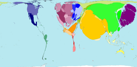
Worldmapper is a collection of cartograms developed using a new algorithm (creating cartograms — “density-equalizing maps” — is extremely complicated; more details here). There are 56 cartograms on the site so far, all global in focus, with more to come soon; the one shown here, for example, is a proportional representation of rail passenger traffic worldwide. Via MetaFilter.
For more about cartograms, and links to some others, see previous entries: Cartograms and Map Distortions; Electoral Maps Made Proportional; Even More U.S. Presidential Election Maps; U.S. Elections Results Cartogram.

Comments
blog comments powered by Disqus