Fire!
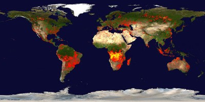
BLDGBLOG’s been having fun with images from NASA’s Earth Observatory again (see previous entry), linking to this collection of MODIS images of Africa during 2005, showing the occurrence of fires deliberately set by people as part of their agricultural cycle. The colours used on the choropleth layer are a bit dramatic: they make the whole continent seem on fire!
World images are here; they’re updated every 10 days. For a less pretty interface (usual clunky GIS/web interface) for what I believe is the same data, see the Web Fire Mapper site. (Also, shapefiles.)
More continentally, there is the Active Fire Maps Program from the USDA’s Forest Service, which also uses MODIS data.
The Canadian Wildland Fire Information System doesn’t seem to indicate whether it uses MODIS data, but it was the subject of a news item on tonight’s edition of Canada Now, CBC’s supper-hour news program: essentially, the question raised was whether real-time fire mapping did more harm than good, particularly if its imprecision (it could be off by up to 200 metres; not everything in an area will be destroyed) led evacuees to believe that their homes and properties were destroyed by fire. (The news item is not online.)

Comments
blog comments powered by Disqus