New York Subway Maps
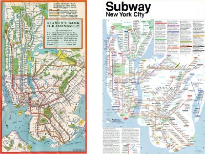
Despite the success of Beck’s London Underground diagram, New Yorkers have historically resisted diagrammatic subway maps, preferring instead maps that are a bit more geographically accurate and take into account surface features like parks, bodies of water and neighbourhoods. Sunday’s New York Times has a story about John Tauranac, the former map designer for the MTA who in the late 1970s led a committee that redesigned New York’s subway map. The 1979 map replaced a previous map designed by Massimo Vignelli in 1972 — a schematic that encountered staunch resistance. New Yorkers, it seems, have and want a sense of distance between points on a subway map. Via Cartography, which has links to other New York subway maps. Anyone know any others?
Update, Sept. 7: Anil Dash writes, “There are, it seems, at least two distinct systems of belief about what constitutes the proper set of assumptions for the New York City subway map. … Should the Metropolitan Transit Authority strive for an idealized conceptual diagram that helps people understand the system at the expense of literal accuracy? Or should the map reflect the true environment that the subway system lives in, providing necessary context even at the expense of superficial clarity?”

Comments
blog comments powered by Disqus