The Piri Reis Map of 1513
The story of the Piri Reis map is the story of how a perfectly innocent 16th-century navigational chart can end up, through no fault of its own, at the centre of a crackpot theory about our planet’s ancient history.
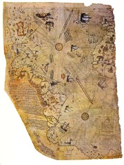 Our story begins in 1929, when the new republican government of Turkey was converting the old Topkapi Palace in Istanbul into a museum. During the work, a map was discovered that was more than 400 years old but had been hitherto unknown. (That in itself is not necessarily surprising: maps of that era were state secrets.) The map was the western third of a portolan chart of the world, drawn on gazelle skin. It covered the Americas, the Atlantic Ocean, the Iberian peninsula and the western part of Africa. The rest of the chart, covering the Mediterranean Sea, Indian Ocean and Far East, is presumably lost forever.
The map was the handiwork of an Ottoman admiral named Piri Reis (“Reis” was his rank — admiral), who in 1513 compiled the map from many different sources — some ancient, some more recent, including Portuguese charts of Asia and charts made by Columbus that were obtained by his uncle in 1501 when he captured seven Spanish ships. Piri wrote about his sources in one of the map’s marginal notes:
In this century there is no map like this map in anyone’s possession. The hand of this poor man has drawn it and now it is constructed from about twenty charts and Mappae Mundi (these are charts drawn in the days of Alexander, Lord of the Two Horns, which show the inhabited quarter of the world; the Arabs name these charts Jaferiye), from eight Jaferiyes of that kind and one Arabic map of Hind, and from the maps just drawn by four Portuguese which show the countries of Hind, Sind and China geometrically drawn, and also from a map drawn by Colombo in the western region. By reducing all these maps to one scale this final form was arrived at. So that the present map is as correct and reliable for the Seven Seas as the maps of our own countries are considered correct and reliable by seamen.
Ironically, it is the map’s correctness and reliability that has since become the issue.
Piri Reis’s map, fascinating on its own, now leaves the realm of 15th-century navigators and enters the lands of ancient astronauts, ice-age civilizations, and shifting poles. Enter Charles Hapgood, who uses the Piri Reis map to argue, in his 1966 book, Maps of the Ancient Sea Kings, a number of extraordinary things. Hapgood saw, at the bottom left of the map, what he believed to be an accurate representation of the ice-free coast of Antarctica. He fit that into his pre-existing theory that the Earth’s poles had shifted in the relatively recent past (or, of you like, that the Earth’s crust had shifted relative to the poles), leaving Antarctica ice-free, and that, 9,500 years ago, there was an advanced civilization that accurately mapped the Antarctic coastline. And that among Piri Reis’s ancient sources were maps from that civilization.
(Hapgood wasn’t alone; Erich von Däniken, fan of ancient alien astronauts, argued it was an azimuthal equidistant projection.)
So, the New Agers argue the following about a piece of a 16th-century portolan chart:
- It’s an insanely accurate azimuthal equidistant projection.
- It accurately shows the ice-free coast of Antarctica.
- It’s evidence of polar shifting.
- The mapping was done by an advanced ice-age civilization.
All of which is based on the fact that the coast of South America curves back towards Africa at the bottom of the map, and that it looks a little like the coast of Antarctica.
It’s an extraordinary claim, and according to the Sagan doctrine requires extraordinary evidence. But as is often the case with pseudoscience, the burden of proof is laid on those who have to disprove the claim. In other words: “Prove I’m wrong.”
So, inasmuch as there are pages about the map’s place in Hapgood’s theory, there are also plenty of web sites dedicated to disproving Hapgood’s theory — not on the basis of its own absurdity, but on Hapgood’s own terms. If claims are made to the map’s accuracy and representation, it’s surprisingly easy to refute them. Both Steven Dutch and Diego Cuoghi do just this, pointing out that
- the map is tremendously inaccurate around the Caribbean, reflecting Columbus’s own errors;
- the map does not fit an azimuthal equidistant projection; and, most importantly,
- the curve in South America’s coast does not match Antarctica nearly as well (for one thing, it misses lots of coastline, as well as Cape Horn) as it does Patagonia, if the map is suddenly turned at that point.
The most persuasive reason for the sudden curve in South America’s coastline is put forth by Paul Lunde:
To put it more simply, Piri Reis, or the scribe who copied his work, may have realized, as he came to the Rio de la Plata, that he was going to run off the edge of his valuable parchment if he continued south. So he did the logical thing and turned the coastline to the east, marking the turn with a semicircle of crenelations, so that he could fit the entire coastline on his page. If that was the case, then the elaborate Hapgood hypotheses — or at least those elements based entirely on the Piri Reis map — would have no foundation whatever.
As is often the case with pseudoscientific theories about old maps, innocuous explanations are ignored in favour of flights of fancy. It’s as though the phrase “Here Be Dragons” was taken, centuries later, as categorical proof of the existence of fire-breathing reptiles.
More links. Web pages dedicated to the Piri Reis map may be found here and here. Charles Hapgood’s theories are tackled by Paul Heinrich and Sean Mewhinney. See also this MetaFilter post from 2004 and the map’s Wikipedia entry.
- Buy — if you must — Maps of the Ancient Sea Kings at Amazon.com
- Buy The Piri Reis Map of 1513 at Amazon.com
- Buy Piri Reis and Turkish Mapmaking After Columbus at Amazon.com

Comments
blog comments powered by Disqus