Eddie Jabbour’s New York Subway Map
After posting the entry about the new Madrid Metro map, it occurred to me that familiarity may be as important as good design: a new map design will almost certainly encounter resistance from users of the current design if the new design departs too much from what is familiar. Concomitantly, those frustrated with or confused by the current design will not only rush to adopt a new, simpler map, they’re usually the impetus for that design.
New York has been a case in point: as I blogged last year, New Yorkers buck the Beck trend by expecting a certain amount of geographic realism in their subway maps: the 1972 subway map by Massimo Vignelli, which persisted until 1979, was, I think, a beacon of Beckian clarity, but it was resisted.
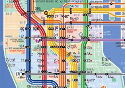 Now someone’s trying again, but unlike Vignelli and, in present-day Madrid, Rafa Sañudo, Eddie Jabbour is not working in an official capacity: his map of the New York subway system — about which there was an article in Sunday’s New York Times — draws heavily on Beck and Vignelli for inspiration and is grounded in his own sense of intimidation in using the 1979 subway map. Notably, the map shows multiple lines for trains running on the same line, a way of differentiating between express and local trains — a point of some confusion, apparently.
It’s taken Jabbour five years on evenings and weekends to produce it. He’s met with the MTA about it, but they weren’t that interested. Opinions are mixed. As you might expect, it seems to be a love it or hate it kind of thing, depending on whether you like the 1979 map.
For a really geographically accurate map of the New York subway system, see this map — and compare.
Via Kottke. See also 37signals’ not-to-be missed post on distortion and maps, using this map and the Beck Underground map as examples.

Comments
blog comments powered by Disqus