Oil Reserves Cartogram
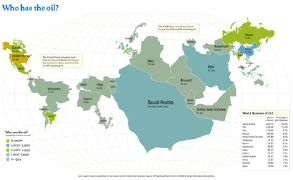 A cartogram showing the world’s oil reserves: the larger the country, the more oil it has. The Arabian peninsula is understandably enormous; see also Nigeria and Venezuela. Not sure how this map works, since both Canada and Russia are disproportionately small despite what I thought were substantial oil reserves. Via Kottke.

Comments
blog comments powered by Disqus