Map of U.S. Carbon Emissions
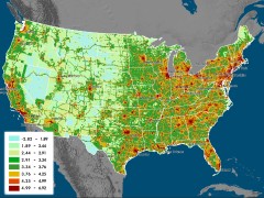 The Vulcan Project, which quantifies North American carbon dioxide emissions, has released maps that shows U.S. CO2 emissions at 100-kilometre resolution — far more detailed than previous efforts. The maps are also updated more frequently. Their most notable finding is that the southeastern U.S.’s carbon footprint is bigger than expected, whereas the northeast’s is smaller. More from CNet’s Green Tech Blog, MetaFilter, Very Spatial and Wired Science. Here’s the press release.

Comments
blog comments powered by Disqus