The Singles Map
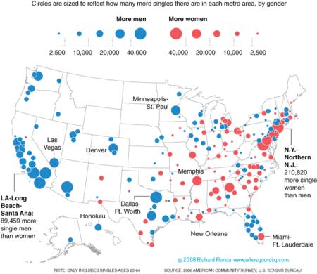
Richard Florida’s singles map of the United States, which charts which metropolitan areas have a surplus of single men and women, first appeared in the Boston Globe; it’s been getting a bit of buzz around the blogosphere. If it looks familiar, it’s because it’s inspired by a similar map from National Geographic in 2007.
Too many clichés can come to mind to explain why there is a surplus of single men in California or single women in New York. You can read too much into a map. Florida’s point is how the quality of a city’s dating scene has an impact on migration; if Florida’s arguments are about the “creative class,” says Julio Gonzalez Altamirano, let’s look only at singles aged 18-44 with at least a bachelor’s degree — at which point the sex-ratio disparities practically disappear.
Via Andrew Sullivan and Cartophilia; see also Ezra Klein.
More of Florida’s maps here.

Comments
blog comments powered by Disqus