Mapping Obesity
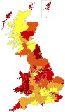 A map of British obesity has been compiled from statistics collected by general practitioners, the BBC reports. Via Infonaut, which presents a similar obesity map for Ontario, Canada. Can’t be compared: the Canadian map starts at 40.9 percent, whereas the highest rate of obesity in the British study is 15.5 percent. Either my fellow Canadians are egregiously fat, or the cutoff point for “obese” is different in each case.
Previously: Health Maps Roundup.

Comments
blog comments powered by Disqus