Three U.S. Election Maps
 CNN, MSNBC and the New York Times provide election results maps that I like. All three are interactive: you can hover over each state to obtain the overall results, and click to zoom in to see county-level results. In MSNBC’s case, you have to click on the state to obtain the vote totals (rather than percentages), and it doesn’t show congressional district boundaries at the national level, but at least it provides presidential, congressional and gubernatorial results through the same interface; you need to click on separate maps to get other results at CNN and the Times (I’ve linked to the presidential maps).
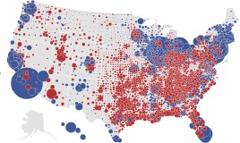
In the end, my favourite of the three is the Times’s map. It’s larger and cleaner, and provides one view the others don’t: a “county bubble map” that shows the raw-vote size of a candidate’s lead by county. County-by-county maps (which are also available) don’t take into account the differences in population size. This is one way to do it, a cartogram is another; I expect to see cartograms of these results very soon.

Comments
blog comments powered by Disqus