Global Map of Accessibility
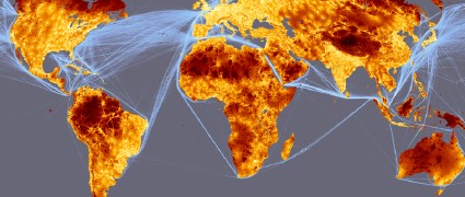
A map released by the European Commission and the World Bank models the accessibility (and isolation) of various parts of the world. It’s a heat map that shows the travel time to major cities (here defined as 50,000 or more people). The oceans show shipping lane density. Via MAPS-L.

Comments
blog comments powered by Disqus