Mapping the Recession and the Stimulus
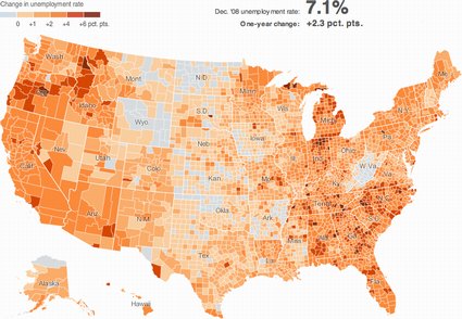
The New York Times always seems to have good online maps; here’s one showing county-by-county unemployment rates. Via MAPS-L.
This CNNMoney.com map shows state-by-state unemployment, state budget deficit, and foreclosure rates. Via Dave Smith.
Also via Dave, another state-by-state map, this time from the Wall Street Journal, displays per capita aid to states from the stimulus package (at least, as it read in late January).
Off the Map takes stimuluswatch.org’s database and plots it on a map to see if the stimulus projects match areas with heavy job losses. Via Slashgeo.

Comments
blog comments powered by Disqus