Slate Maps U.S. Job Losses
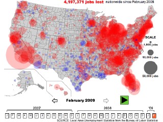 The latest interactive map of unemployment in the United States comes to us from Slate: this one also shows county-by-county job losses, but measures job losses in a slightly different way: for each month selected, it shows the year-over-year job losses for each county (e.g., you select January 2009 and it shows you the job losses since January 2008). Via The Map Scroll.
Previously: U.S. Unemployment and Job Losses; Mapping the Recession and the Stimulus.

Comments
blog comments powered by Disqus