Testing Light-Pollution Maps
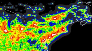 Sky and Telescope’s Tony Flanders decides to test the veracity of light-pollution maps. “They’re based on satellite data collected more than a decade ago, over a long timespan, in varying conditions, and massaged by an experimental mathematical model of how skyglow spreads,” he explains. But his measurements, taken around Boston, “cast some doubt on the mathematical model behind color zones. For one thing, my measurements were consistently darker than the ones predicted by the key to the Clear Sky Chart’s light-pollution maps. More intriguingly, the skyglow did not increase continuously, as I had expected, but followed an unmistakable step pattern. This suggests that highly local conditions play a larger role in skyglow than I would have guessed.”
Previously: Light Pollution Maps.

Comments
blog comments powered by Disqus