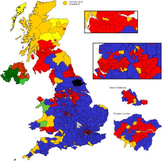
Mapping the 2010 British Elections
 Finally getting around to looking at some online maps of the results of the general election in the U.K. held last week. I’m surprised at how similar the maps produced by different media organizations are to one another. Both the BBC’s and the Telegraph’s election results maps toggle between geographical maps of Great Britain and Northern Ireland and hexagon-based cartograms that give each constituency the same area. Others take one side of the geographic/cartogram divide: the Times’s map is resolutely geographical, the Grauniad’s a square-based cartogram, which though unlovely is at least different from the rest. It’s hard to tell the geographic election maps apart, really; the media orgs’ maps aren’t much different from the public domain map produced for Wikipedia (at right).
See also Cartophilia and The Map Scroll.
Previously: British Election Previews.

Comments
blog comments powered by Disqus