Obesity and Transportation
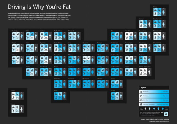
Good correlates how Americans get to work with obesity rates in a map-like infographic that is, well, information-dense and hard to follow at a glance. You have to look closely at each state’s box to see where they rank. There are five variables at play here — would there have been a better way of doing this? Via brownpau.

Comments
blog comments powered by Disqus