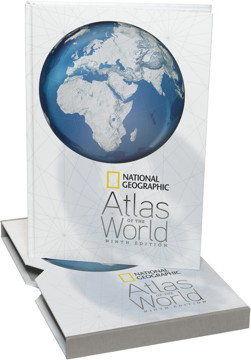
Review: National Geographic Atlas of the World, Ninth Edition
National Geographic Atlas of the World, Ninth Edition
National Geographic, 2010. Hardcover with slipcase, 424 pp. ISBN 978-1-4262-0634-4.
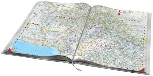
 National Geographic’s world atlases go in a different direction than other world atlases on the market. Instead of a relief map palette that is found virtually everywhere else, National Geographic maps are both minimalist and, for the most part, political: land is white except for coloured country outlines. (They’re also the most obvious example of the four-colour theorem in practice.) I know that the style is not to everyone’s taste, but I actually prefer it. I’ve also found that you can pack a lot more detail, legibly, onto a map in a National Geographic style than you can on a coloured relief map.
The ninth edition of the National Geographic Atlas of the World comes five years after the eighth edition. Despite a new cover design, a change in the map titles’ typeface and considerable changes under the hood, the ninth edition does not represent a radical departure from the eighth. In this review, I’m going to compare the two editions rather closely to give you a sense of what has, in fact, changed.
What hasn’t changed is the sheer size of this atlas. At 47.2 × 31.6 cm (without the slipcase), it’s exactly the same size as the eighth edition; it’s also taller by two centimetres than the Times Comprehensive Atlas and more than 10 centimetres taller than the Oxford Atlas of the World. All of these atlases are unwieldy, and need ample table space to be used — the National Geographic atlas is just the biggest and the unwieldiest. Trying to open up this atlas in your lap, or in your hands standing up, is just asking for it. (And if you think wrangling one atlas is fun, try wrangling two of them at once for the purposes of a review.)
The most noticeable difference between the eighth and ninth editions is the presence of eight new regional maps, added because of their relevance to recent world events and concerns. I was particularly pleased to see the new 1:4,123,000 map of Greenland and the 1:1,550,000 map of the Caucasus: these two regions are very much in the news (for very different reasons), but they’re not often the subject of detailed maps. Also new are close-up maps of the Amazon region, Iraq and Iran (with provinces), the Arabian peninsula, Afghanistan and Pakistan, the Korean peninsula, and the Horn of Africa — in other words, many of the political and environmental hotspots in the world today.
Otherwise, regional coverage is fairly thin outside the United States and Europe. North America gets 23 plates and Europe 14, but South America and Africa only get six each (and in both cases that’s up one from the previous edition). Asia’s increase from 13 to 17 plates is certainly welcome, but in the case of every continent I kept wanting more regional maps, or the same maps at smaller scales, or split into two. (In comparison, the Oxford Atlas of the World has this advantage: even if its plates are less detailed and contain less information, there are a lot more of them.)
Moreover, is it really a good idea to have new, separate maps of the Koreas, or of Afghanistan and Pakistan, at smaller scales, and leave India and Japan to the older maps at larger scales? Why Korea at 1:2,000,000 and Japan (and Korea) at only 1:3,955,000? (The answer, of course, is resources and priorities: the Japan and Korea map already existed and could simply be updated.)
The thematic maps and cartograms at the front of the atlas have also been reworked and reorganized. They’re in a single section now, rather than the two (in the eighth edition, they were split into “Natural World” and “Human World”), and many of the maps that have been carried over have been completely redesigned — for example, the exquisite freshwater map we saw earlier this year in the magazine — or, if the principal map has been left unchanged, it’s accompanied by new material. There are more maps, too, with an even greater focus on cities (more on which anon) and the human condition.
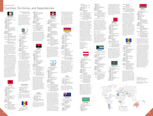
The Nations section, with flags and descriptions of each country and territory, is longer: key maps showing where each country on a given plate is found on a world map add three pages (see bottom right of image above); the section on Canadian provinces and U.S. states has been compressed from two plates to one.
Now what’s interesting is that despite the presence of these new regional maps, the ninth edition has exactly the same number of plates — 137. Some cuts had to be made to accomodate the new material. Among those cuts: the satellite map of the world, the 1:7,000,000 map of southwestern Asia (now redundant, replaced by the three new maps of the Caucasus, Iraq and Iran, and Arabia), and the entire Cities section (which frankly I won’t miss — losing those to get the new regional maps is an excellent trade).
Other changes:
- The ocean floor maps are new, blacking out the landforms, and are at a different scale.
- Cyprus has been added to the map of Greece and the Aegean, even though it’s equally well covered on the Eastern Mediterranean map (but Cyprus, at least part of it, is now part of the European Union).
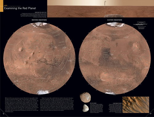
- The Mars map, updated to include new data from orbiting spacecraft, is on a different projection (see above), and the Solar System plate has been redone (Pluto has been demoted).
- The maps are slightly differently organized: Canada now comes before the U.S. and the Arctic comes before Antarctica.
(I created a spreadsheet to keep track of the changes between editions; it’s available as a PDF if you really want to have a look.)
Where National Geographic maps excel is in their handling of the current political situation: the maps reflect the facts on the ground, but, as anyone who’s looked at a map knows, there’s always a little bit of red type to explain competing claims. Disputed territories — the West Bank and Western Sahara, South Ossetia and Somaliland — are grayed out. Sometimes the colours of the official national boundary enclose the grayed-out area, sometimes they don’t. It’s not always consistent, either: Somaliland shows up in gray on two Africa plates, but if it shows up on the edge of a map of Asia, it’s shown as part of Somalia. Scale and clarity may play a role in this.
The underlying map data has also been brought up to date. The changes to the Aral Sea from one edition to the next are downright frightening, for example. A few checks of things I knew to be relatively new revealed a few quibbles: the Ninth Edition catches the completion of the limited-access Trans-Canada highway across New Brunswick, but not the SNCF’s LGV Est; discontinued passenger rail service still appears on maps of Canada; high-speed rail service, rather than lines, are tracked (so, for example, high-speed rail is shown as connecting Besançon, France, though TGVs travel on regular tracks east of Dijon).
In an era when detailed maps of faraway lands are a click away and cartograms can be generated on the fly with software, it’s an open question whether a big, heavy, expensive atlas like this has a place. As a reference tool, the flagship atlas’s time may well have come: if you’re looking for a tiny village in a far-away country, you’ll probably have better luck online (my own town of 1,500 people does not appear on the Eastern Canada plate, for example — but it does on the U.S. Middle Atlantic plate); similarly, the Ninth’s thematic maps cannot compete with what you can find on the Web. Even a flagship atlas, in other words, has limits. It cannot contain everything; there is always something more that could be added: another cartogram, another regional map, another town to an existing map.
But those of us who ascribe totemic significance to maps will not question the need for such an atlas. And as someone who likes to graze maps, rather than look for specific things, I much prefer larger paper maps to something I can call up on my iMac or iPad. Even a 24-inch screen cannot compete with the simultaneous breadth and resolution — the ability, in other words, to provide instant context — of a printed page.
For me, at least, this is not an either-or question.
One question is whether you should buy the Ninth Edition if you already have the Eighth. This is no small decision for a $175 (list price) atlas, and it’s why I’ve spent as much time as I have comparing the two versions. It will largely depend on whether the updates are important to you and whether you’re the large-atlas equivalent of people who upgrade their phones or cameras every year. But if you like National Geographic’s maps and you don’t have an earlier edition of this atlas, then there’s no reason at all not to pick this atlas up. (Of course I would say that. I think maps, atlases and books about maps should have money spent on them. The fact that I get affiliate revenue when you do so from this site is only incidentally, albeit very, mercenary and self-interested.)
Now it’s just a question of finding a bookshelf tall enough for it to fit.
I received a review copy of the Ninth Edition, but bought my own copy of the Eighth. All images furnished by the publisher.
Previously: New National Geographic Atlas Reviewed; Ninth Edition of National Geographic’s World Atlas Published; National Geographic World Atlas: Eighth Edition on Sale, Ninth Edition Coming Soon.
- Buy National Geographic Atlas of the World, Ninth Edition at Amazon.com (Canada, UK)
- Buy National Geographic Atlas of the World, Ninth Edition at the National Geographic Store (other versions: softcover, personalized, Platinum Edition with case, Platinum Edition without case)

Comments
blog comments powered by Disqus