The New York Times Maps the 2010 U.S. Midterm Elections
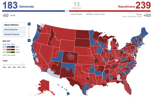
The New York Times’s election results maps — House, Senate, gubernatorial — are, as usual, awesome. Pickups are clearly indicated, so you can see at a glance what’s changed. You can drill down to county-level results easily, and a county bubble map feature compensates for the fact that some counties are much, much larger than others (otherwise you might be hard pressed to see why, for example, Sharron Angle or Christine O’Donnell lost without looking at the raw numbers — they won all the small counties but lost one or two big ones). Detailed, immersive, easy to use — really well done overall.

Comments
blog comments powered by Disqus