Cartograms for the 2008 U.S. Presidential Election Results
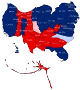 As I predicted, some cartograms of the U.S. presidential election results are already available. These cartograms distort the size of each state based on the number of their electoral college votes — making Rhode Island, with four electoral votes, larger than Alaska, with three. Declan Butler has put together cartograms for presidental elections back to 1964; the shapes change as the populations shift from election to election. A similar principle is behind this interactive map. Thanks to Richard and Frank for the links.
Previously: U.S. Election Results Cartogram (for the 2004 elections).

Comments
blog comments powered by Disqus